
A website redesign can be beautiful and still underperform.
That is not a criticism of design. It is a consequence of asking one discipline to solve four different problems.
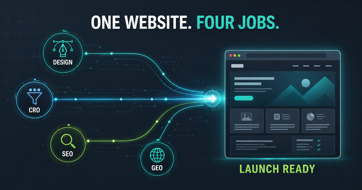
Designers are responsible for visual hierarchy, usability, brand expression, and the way a visitor experiences the page. Conversion rate optimization (CRO) teams need the page to move the right users toward a measurable action. SEO teams need search engines to discover, understand, index, and rank the page for the correct intent. Generative engine optimization (GEO) adds another question: can AI systems clearly extract what the company offers, who it serves, how its products differ, and why its claims are credible?
These needs overlap, but they are not interchangeable. When CRO, SEO, and GEO reviews happen only after a design is approved, the team is no longer optimizing the page. It is negotiating what can still be saved without disrupting the design or launch date.
The better approach is to involve all four disciplines before the new experience is locked.
A platform page and a product page do not have the same job
This distinction became especially clear during a recent review of a new SaaS platform-page design.
The proposed design was a strong general representation of the platform. It improved the visual system, told a broader brand story, and helped users see how several solutions fit together. From a design perspective, that was useful progress.
But the existing page had been built around a specific product category and its commercial search intent. Replacing that product-level specificity with a broader platform narrative would have created a different set of problems:
- The primary product would no longer be named clearly enough in the hero and supporting headings.
- High-intent visitors would have to interpret broad platform language before confirming that the company solved their specific problem.
- Product modules, workflows, integrations, implementation details, and proof could be compressed into visual cards or tabs with too little explanatory copy.
- Search engines and generative systems would have fewer explicit statements connecting the brand, product, audience, use case, and outcome.
- A general call to action could replace a product-specific conversion path.
The problem was not that the new design was wrong. The problem was that a platform page and a product page were being evaluated as though they served the same purpose.
A platform page should explain the breadth of the company’s ecosystem, establish the shared value proposition, and route visitors into the right product or solution.
A product page should capture category-level demand, demonstrate specific capabilities, resolve objections, show proof, and convert a visitor whose need is already more defined.
One page can support both goals, but only when the information architecture and content hierarchy deliberately preserve both. A polished design cannot make vague copy specific, and a product illustration cannot replace an explicit product explanation.
What each discipline is trying to protect
Collaboration becomes easier when the team understands that each discipline is protecting a different part of the growth system.
Design protects comprehension and experience
Designers determine how users perceive and navigate the page. Their priorities typically include:
- Visual hierarchy and scanning patterns
- Brand consistency and differentiation
- Responsive behavior across devices
- Accessibility and readable interaction patterns
- Component consistency and development feasibility
- The pacing of the story from one section to the next
Good design reduces cognitive load. It helps visitors recognize what matters, understand relationships, and move through the experience without friction.
CRO protects intent and action
CRO asks whether the page helps the right visitor take the right next step.
That requires more than placing a button in the hero. A conversion-focused review looks at:
- Whether the hero confirms the visitor’s problem and desired outcome
- Whether calls to action match the visitor’s stage and level of intent
- Whether proof appears before major moments of hesitation
- Whether key objections are answered through implementation, migration, integration, security, pricing, or process content
- Whether different audiences have clear routes through the page
- Whether the page can be measured and tested after launch
A page can be easy to use while still failing to persuade. CRO closes the gap between usability and commercial action.
SEO protects demand and discoverability
SEO ensures that the redesign does not disconnect the page from the demand it is supposed to capture.
The review should cover:
- The search intent assigned to the URL
- The title tag, H1, headings, and body copy needed to confirm that intent
- Internal links and descriptive anchor text
- Crawlable navigation and links
- Indexable content within tabs, accordions, and interactive components
- Canonicals, redirects, status codes, and metadata
- Image, video, JavaScript, and performance implications
- Preservation of content and links already contributing to organic visibility
This is particularly important when a redesign makes the language shorter and more conceptual. Brand copy may sound better while becoming less precise about the actual category, product, audience, or use case.
GEO protects explicit meaning and extractability
GEO is often treated as a new layer of tactics. In reality, its most durable requirements reinforce strong SEO and strong content design.
Google’s current guidance says that its generative search experiences still rely on foundational SEO, indexed pages, crawlable content, clear technical structure, and useful original information. Google also states that there is no special AI schema or required writing format for inclusion in its generative search features. (Google Search Central)
The practical GEO question is therefore not, “Did we add an AI optimization trick?” It is, “Did we make the company’s meaning explicit enough to retrieve and cite accurately?”
That means a page should clearly state:
- What the company and product are
- Who the product is for
- Which problems and workflows it addresses
- How the platform and individual products relate to one another
- What differentiates the solution from alternatives
- Which claims are supported by customer evidence, data, certifications, or expert experience
- Where concise answers, comparisons, definitions, and FAQs would help both people and machines understand the offer
A diagram can show that three products are connected. The copy still needs to name those products and explain the relationship. A testimonial can signal trust visually. The surrounding text still needs to establish who achieved what result and why it matters.
The most common redesign failure points
The largest risks usually come from reasonable design decisions that have not been reviewed through the other three lenses.
1. The hero becomes memorable but ambiguous
A short brand statement may be emotionally stronger than a keyword-heavy headline. But if the hero does not identify the product category, intended audience, or core outcome, visitors and search systems have to infer too much.
The fix is not to turn the hero into a paragraph. Use a clear H1, a concise value proposition, and a specific supporting sentence. The page can still sound like the brand while naming what it sells.
2. Product detail is compressed into interface elements
Tabs, sliders, cards, and interactive diagrams can organize complexity. They can also reduce critical product information to labels and fragments.
Before using an interactive component, define the minimum crawlable and visible copy required for every product, feature, or use case. Google can render JavaScript, but server-side rendering or pre-rendering can improve speed and make content more consistently accessible to crawlers and other bots. (Google Search Central)
3. Proof is treated as decoration
Logo bars, testimonials, customer metrics, certifications, and case-study links should not be added only to balance a layout. They reduce risk for the buyer.
Proof should appear near the claim or objection it supports. If a section claims faster implementation, place implementation evidence there. If the page claims the platform is designed for a particular industry, show customers and outcomes from that industry.
4. The call to action is visually clear but contextually weak
“Learn more” may fit a component system, but it rarely tells users what happens next. A platform page may need routes to individual products, while a product page may need a demo, assessment, pricing, or implementation CTA.
CTA hierarchy should follow user intent, not component availability.
5. Visual ambition creates performance debt
Large media files, animation, third-party scripts, and complex interactive modules can make a page feel premium in a prototype and slow in production.
Core Web Vitals measure loading performance, visual stability, and responsiveness using real user experience data. Google’s web performance guidance also notes that design and business decisions have a direct influence on performance, engagement, and conversions. (web.dev)
Performance budgets should therefore be part of design requirements, not a cleanup task assigned to development after launch.
6. Existing demand is removed without a content map
Redesign teams often assess sections by visual relevance. Search and CRO teams need to assess them by functional value.
Before deleting or consolidating content, document which queries, internal links, backlinks, assisted conversions, and buyer objections each section supports. If content must move, define its new destination before the old experience is removed.
7. Measurement is added at the end
Analytics events, form tracking, CTA identifiers, experiment readiness, and CRM attribution should be planned with the components. If measurement is postponed until after development, teams often launch with duplicated events, missing context, or no reliable baseline.
A better collaboration model for website updates
The goal is not to create a larger approval committee. It is to make the right decisions while they are still inexpensive to change.
Strategy
Design: Establish the experience, visual direction, and component needs CRO, SEO, and GEO: Define audience, page intent, conversion goal, search demand, and entity/product relationships Required output: Shared page brief
Wireframe
Design: Build hierarchy and user flow CRO, SEO, and GEO: Validate hero clarity, CTA sequence, proof placement, product depth, headings, and internal routes Required output: Approved content hierarchy
Content and high-fidelity design
Design: Pair copy with the visual system CRO, SEO, and GEO: Finalize product-specific language, answer blocks, proof, metadata, and conversion copy Required output: Complete designed content, not placeholders
Development
Design: Preserve component behavior and responsive intent CRO, SEO, and GEO: Validate rendering, crawlable links, schema, canonicals, redirects, analytics, and performance budgets Required output: Technical acceptance criteria
Staging QA
Design: Review visual fidelity and accessibility CRO, SEO, and GEO: Test mobile UX, forms, events, indexability, rendered content, status codes, page speed, and migration rules Required output: Cross-functional launch signoff
Post-launch
Design: Address design defects and behavior issues CRO, SEO, and GEO: Monitor rankings, organic landing traffic, qualified conversions, CRM progression, Core Web Vitals, and AI-search visibility Required output: Prioritized optimization backlog
The key deliverable is the shared page brief. Before wireframes begin, every major page should have an agreed primary audience, job, search intent, conversion action, proof requirements, content requirements, and technical constraints.
Without that brief, each team optimizes for a different definition of success.
The pre-launch questions every team should answer
Before a new page or redesign goes live, the team should be able to answer these questions without interpretation:
- What is this page’s primary job?
- Is it a platform, product, solution, industry, comparison, or educational page?
- Which audience and stage of intent does it serve?
- What exact product or service must a visitor understand within the first screen?
- What is the primary conversion action, and what lower-commitment action supports it?
- Which claims require proof, and is that proof placed near the claim?
- Which existing search queries, links, and converting content must be preserved?
- Can important copy and links be found in the rendered page without relying on fragile interactions?
- Are the title, H1, headings, metadata, canonicals, and structured data correct?
- Have forms, CTAs, media, analytics, CRM attribution, mobile behavior, accessibility, and performance been tested on staging?
If these questions are answered after final design approval, the process is already late.
Collaboration protects the value of the design
Design, CRO, SEO, and GEO are not competing priorities. They are different controls on the same growth system.
Design makes the experience understandable and credible. CRO turns that experience into action. SEO connects the page to existing demand. GEO makes the company’s meaning and evidence easier for AI-driven discovery systems to retrieve and explain.
When these teams collaborate early, the result is not a compromised design. It is a stronger one: a site that looks modern, communicates clearly, preserves visibility, loads efficiently, and gives qualified visitors a reason to act.
The cost of collaboration is a few structured reviews before launch. The cost of skipping it can be lost rankings, weaker conversion rates, unclear product positioning, broken measurement, and months of retrofitting work after the new site is already live.
If your team is planning a redesign, platform-page update, or site migration, DataXGrowth’s Growth Audit can identify the highest-risk gaps across UX, CRO, SEO/AEO, analytics, and site performance before they become post-launch problems.
Frequently asked questions
When should SEO and CRO teams join a website redesign?
They should join during strategy and wireframing, before the page hierarchy and component system are approved. This is when search intent, conversion paths, proof requirements, and crawlable content can be incorporated without expensive redesign or development changes.
Is GEO separate from SEO during a redesign?
GEO adds a useful review lens, but it should not be treated as a separate set of hacks. Strong GEO depends on the same foundations as strong SEO: crawlable and indexable content, clear product and entity relationships, useful original information, credible evidence, and a technically accessible page.
Can a platform page replace individual product pages?
Usually not when the products serve distinct search intents, audiences, workflows, or conversion paths. The platform page should establish the shared ecosystem and route users to product pages. Each product page should preserve the explicit category language, capabilities, proof, objections, and calls to action needed for its own demand.
What should be tested before a redesigned site launches?
Test visual fidelity, mobile usability, accessibility, forms, CTA tracking, CRM attribution, rendered and indexable content, crawlable links, metadata, canonicals, redirects, status codes, structured data, page speed, and Core Web Vitals. Compare the new experience with the existing site’s search and conversion baselines before launch.